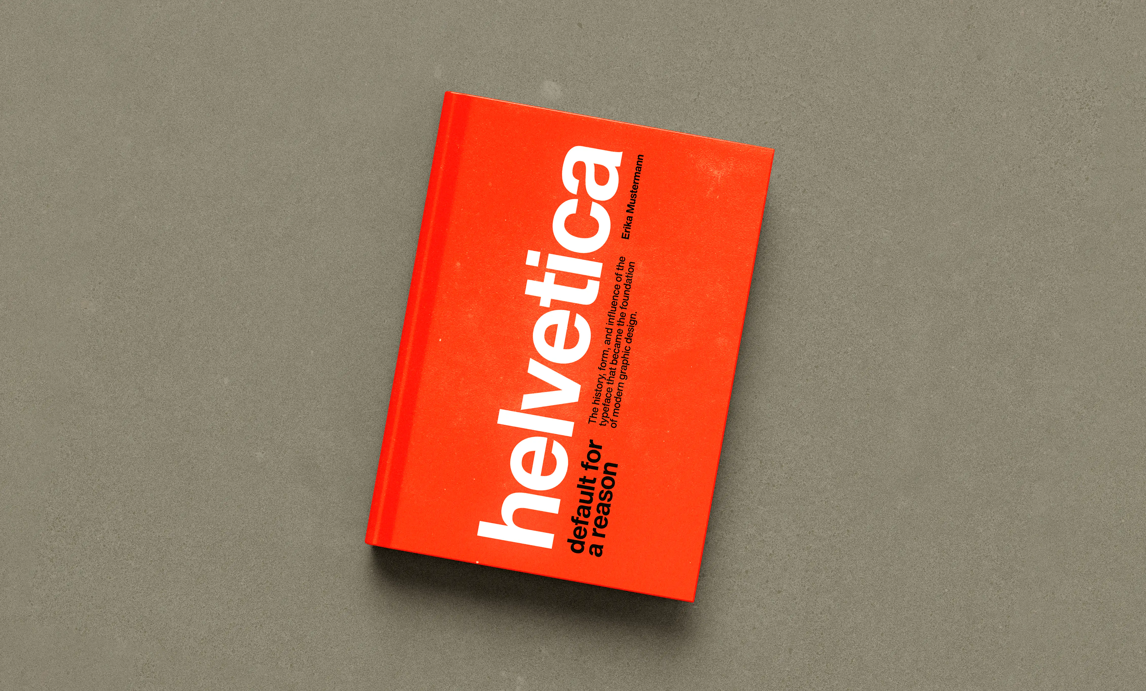
Helvetica: Default for a Reason
Publication Design
Helvetica: Default for a Reason explores the history, anatomy, and impact of the world's most universal typeface. The book follows Swiss design principles such as grid systems and generous whitespace, allowing the typography to be the star of the show.
Story
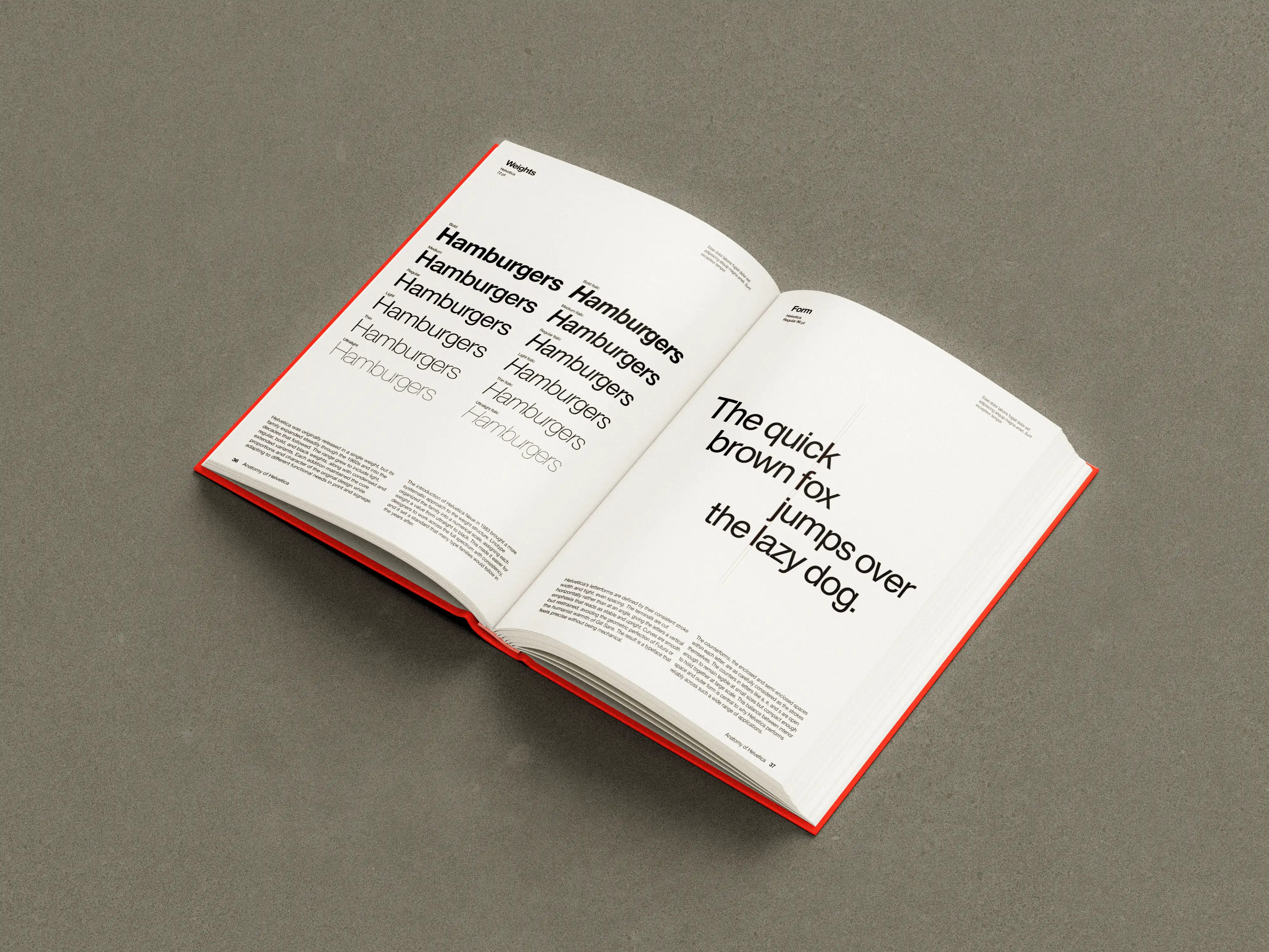
Helvetica was designed in 1957 by Max Miedinger and Eduard Hoffmann at the Haas Type Foundry in Switzerland, originally under the name Neue Haas Grotesk. It was later renamed Helvetica, derived from the Latin word for Switzerland, to give it broader international appeal. The typeface quickly became a staple of the Swiss style and was adopted by corporations, governments, and transit systems worldwide. Its clean, neutral forms made it endlessly versatile, and it remains one of the most widely used typefaces in history.
Design
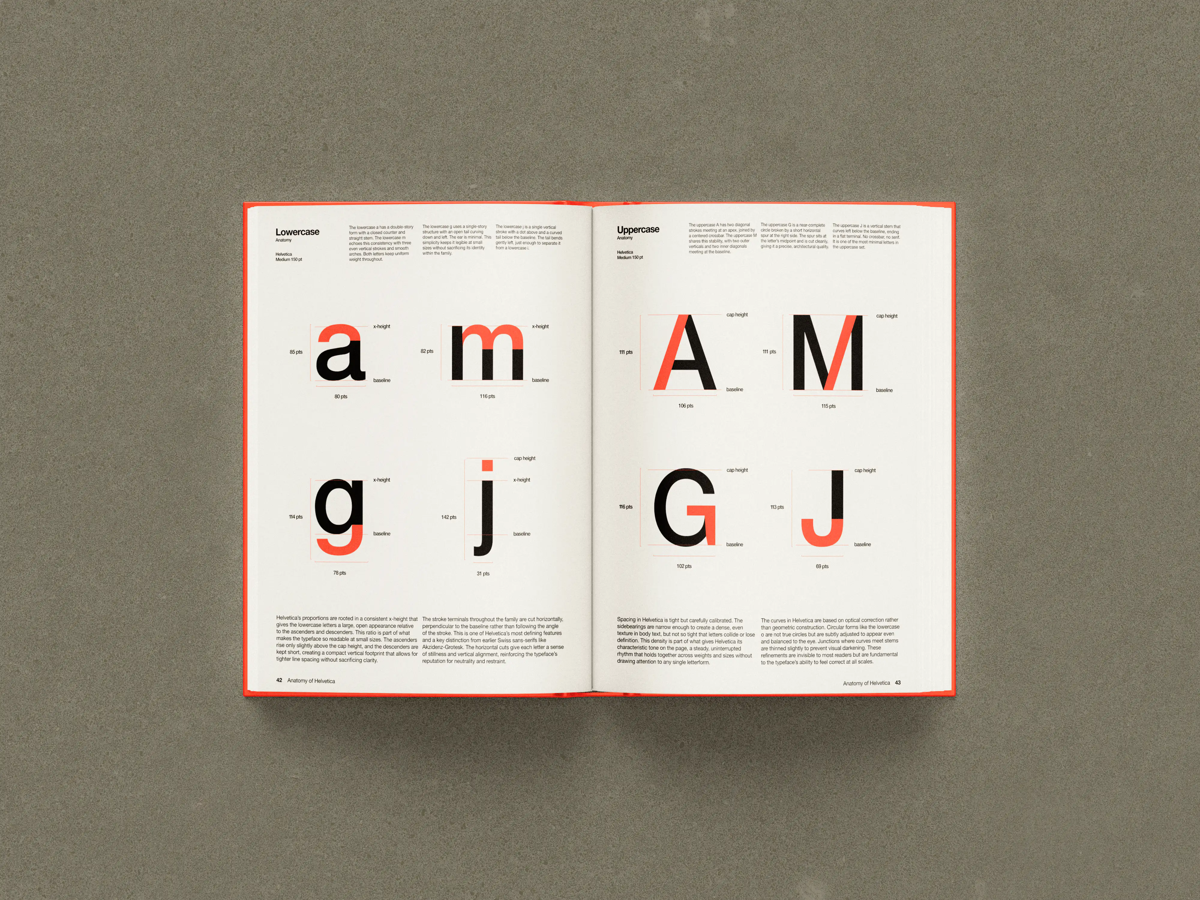
Helvetica: Default for a Reason was designed to match the Swiss style where the typeface excels the most. Strict grid systems, typography-first layouts, and a bright red-orange accent color help to place Helvetica in context and show readers the beauty that lies in the mundane. Type specimens and detailed anatomical diagrams dissect Helvetica’s form to show why it’s so effective.

The fictional publisher of this book, Ellenwood Publishing.


